Art by Design
2023 featured year-end postcard sets with an interesting new design, using the vanitas drawing, “Dried Roses on China.”
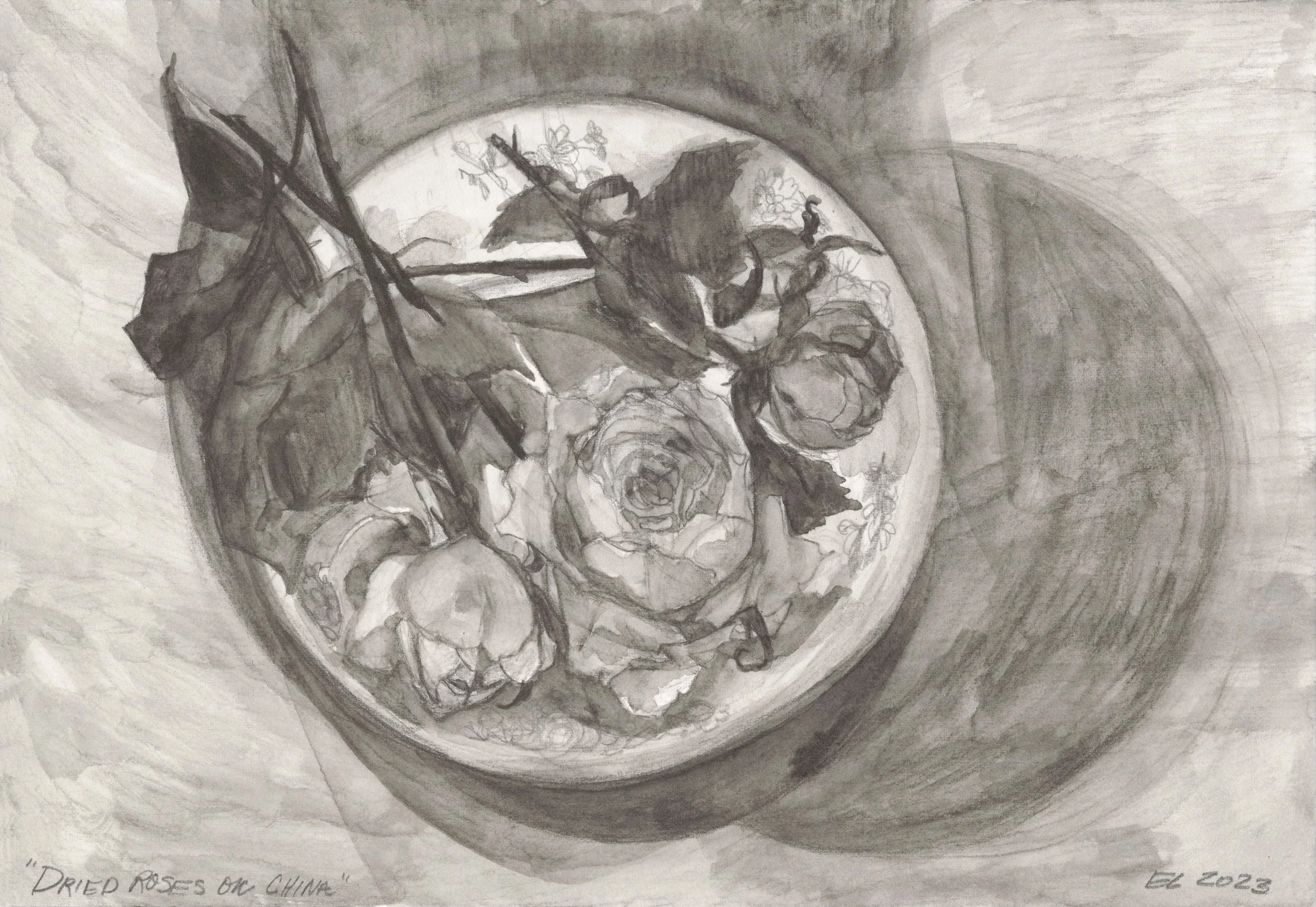
“Dried Roses on China - Vanitas Drawing” in color.
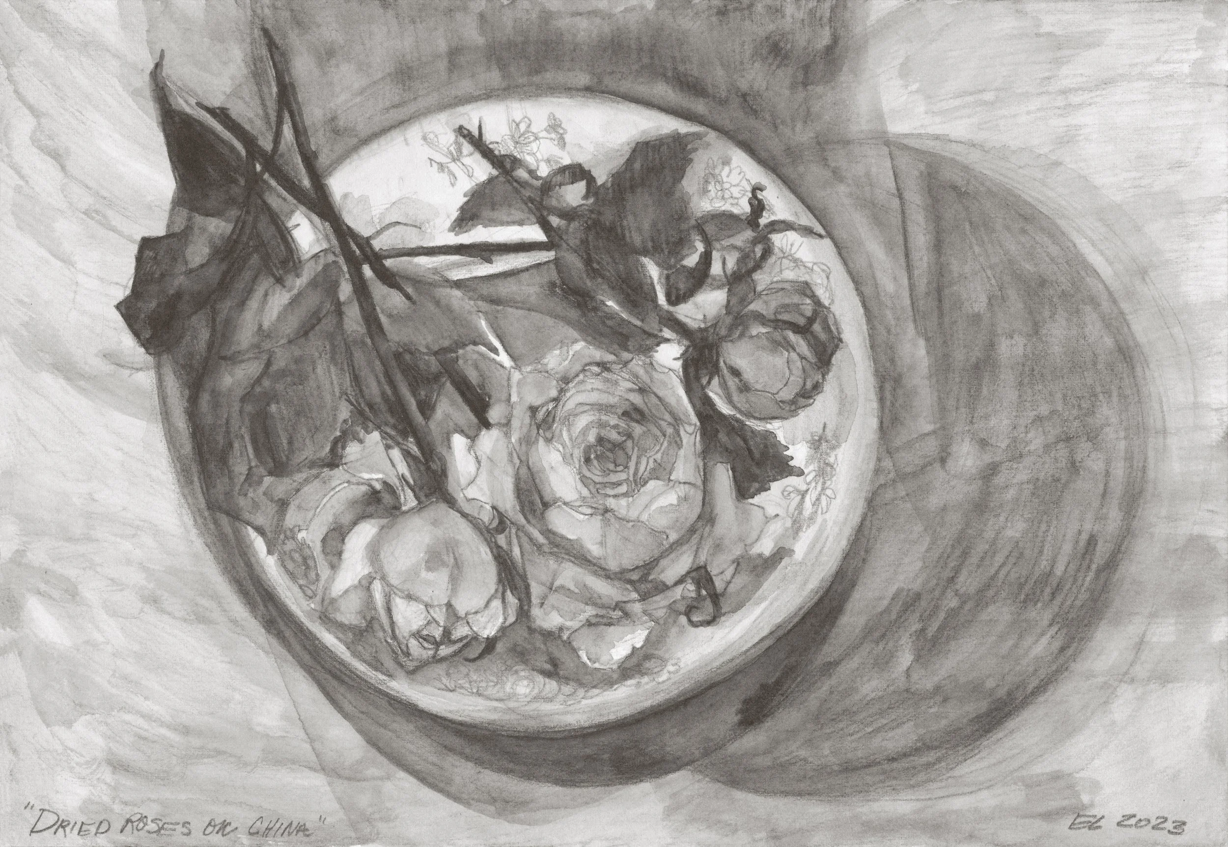
“Dried Roses on China - Vanitas Drawing” in black and white.
A vanitas drawing, or painting, is a still life artwork, depicting objects meant to remind the viewer of their mortality. Typically, they consist of beautiful objects that have decayed or are decaying, such as a human skull or a ripe apple that is turning rotten. The decaying objects are intermixed with objects that signify beauty, such as a mirror or string of pearls. Together, the intermixed objects represent the beauty of life and youth, with a reminder of just how short-lived it is.
The drawing, “Dried Roses on China,” falls into this vanitas vein, as it combines beauty and death in one still life artwork. The dried roses, once alive and beautiful, are now resting, dried out, on a small china plate. In my artwork, I am constantly exploring ways to pair ideas of beauty and death, and this vanitas drawing was a way for me to do just that. You can see the process photos for making this artwork on my Patreon’s main site here: Process Photos! Dried Roses on China.
If you are a Supporter level on my Patreon page, you receive exclusive postcard sets at the end of each year. The postcard sets - which are art print packages in their own right - are specially designed and hand-packed by me, using artwork I created in that year. Because of the beauty of “Dried Roses on China,” I chose to use it on the face of this year’s annual postcard design.
The postcard sets this year feature two color variations: one color and one black and white. They also feature fun in-seam colors on luxe paper in order to accentuate the tonal differences of the artwork printed on the cards! I was really excited about the outcome, and I hope you love it, too!
The design solution of two color variations stemmed, as it turns out, from a printing predicament. Early on in the fall, I told my photographer, Mike, that I wanted to use “Dried Roses on China” for my end-of-year postcard sets, and I asked him if he could make a color-matched scan and a test print for me.
It’s funny, but some artwork photographs well, and some does not. Some artwork prints well, and some does not. The only way to be sure that a piece of artwork does both is to do it. And when we printed this one, it was perfect. We both knew that it would work great as an art print or postcard set.
That being said, when I went to pick up the drawing, Mike had two print options for me: one color and one black and white.
When Mike scans or photographs my drawings, he keeps them “warm.” Meaning, he allows the “color” of the drawing page to show through. Typically, drawing paper has an off-white, or creamy, hue and it is rarely true white. The paper can create more of a yellow tone in the photograph, which in turn, makes it feel “warm.” In most copies of my drawings, the “tonal” color is color-matched to the original drawing.
Sometimes, the yellow undertone of a paper is too strong, and when paired with the natural gray/blue hue of the graphite, the printed version will have a unnatural green hue, even if the original drawing and digital photograph do not. This is because an inkjet printer will try its best to generate the “warm” off-white or cream color of the paper by using ink - and it will oftentimes use yellow because it is the closest color to the original drawing paper’s tones. Printers use only four colors: cyan (blue), magenta, yellow, and black. So the printer will try its best to recreate the colors and oftentimes a creamier drawing paper will push the printer to dispense too much yellow, and offset it by using quite a bit of cyan (blue) in the graphite coloration, leaving the resulting print with an overall green hue.
Unfortunately, I do not make prints or sell them if a drawing prints with a green hue. There is really no adjustments that can be done, and I feel it simply does not follow best practice standards to sell a “green” print. That’s why Mike and I were happy that this drawing came out very naturally colored and matched the original drawing perfectly.
However, it is because of this typical coloration predicament, that Mike usually prints a black and white version of the artist proof as well. Even though the color proof ran nicely, he also printed a black and white version (with the color removed) as protocol. It may be counterintuitive to think that a “black and white” drawing has color, save for the aforementioned warmness of the original paper and graphite, but it does. To make the black and white version, Mike simply removed all tonal color in Photoshop. I loved the black and white version just as much as I loved the color version, and I couldn’t decide which one I wanted to use for the postcard sets so I used both! I felt that the black and white design added a slightly edgier addition. I hope you enjoy both options just as much as I do.
2023 postcard set preview video.